“How many fonts should our website use?” Owners ask us this more than almost any other design question. Say a yoga studio owner arrives with three brand guides from three different designers. Each recommends a different set, and between them they name seven typefaces.
Introduction
Our answer was two, and quite often one. Fonts are one of the few design decisions an owner can make well without any training, because the questions behind them are practical. Can people read it on a phone in the sun? Does it slow the page down? Does it look like your business or like a template?
This guide covers those three questions, what the numbers say about how websites use fonts today, and a short way to choose. It’s written for the person who will sign off the design, not the person who builds it.
What it actually means
Two jobs, two fonts at most
Most websites need type for two jobs. Headings have to catch the eye and set the tone. Body text has to disappear, so people read the words without noticing the letters.
You can do both jobs with one family that comes in several weights, such as a regular weight for paragraphs and a bold for headings. That’s the simplest and fastest choice. Or you can pick one font with more personality for headings and a calm, plain one for body text. A third font rarely adds anything a reader would notice. Apple’s design guidelines for app makers put it plainly: “Minimize the number of typefaces you use.”
The usual extras that creep in are a script font for a tagline, a different font for buttons, and an icon font. Each one is another file to download and another style to keep consistent.
Readable on a phone
Body text on a phone needs to be large enough to read at arm’s length. Apple’s guidelines, last updated in December 2025, set 17 points as the default body size on iPhone and iPad. On the web we treat 16 pixels as the floor for paragraphs, and we usually go a little larger.
The accessibility rules don’t set a minimum size. What they do require, in WCAG 2.2, is that text can be enlarged to 200 percent without anything breaking (success criterion 1.4.4), and that the layout survives if someone increases line height to 1.5 times the font size and adds more space between paragraphs, letters and words (1.4.12). A font with generous spacing and clear letter shapes makes both easier. Watch for a capital I, a small l and the number 1 that look alike, and for letters that turn into smudges at small sizes.
What fonts cost in speed
Every font weight you load is a file. The HTTP Archive’s Web Almanac for 2025, published in January 2026, found the median font file is in the mid-to-upper 30 KB range once compressed. One file is cheap. Eight files (two families, each in regular, italic, bold and bold italic) start to add up on a slow mobile connection.
The same report found Google Fonts on about 54% of desktop sites and 47% of mobile sites, and about 72% of sites serving at least one font file from their own server. Both approaches work. What matters more is how the font is loaded:
- web.dev, Google’s guide for developers, recommends WOFF2 files, which it says compress 30% better than the older WOFF format, and trimming fonts down to the characters you need.
- A CSS setting called font-display decides what visitors see while the font downloads. With “swap”, MDN explains, the browser shows text in a fallback font straight away and swaps in your font when it arrives. Only about half of pages set it at all, according to the Almanac.
Ask your developer which fonts and weights the site loads and whether they use font-display. It’s a one-line answer.
A real-world example: the yoga studio
Say the studio’s three guides name, between them, a hand-lettered script, two display fonts and four text fonts, and the current site loads the script for the logo text, a display font for headings and a text font in five weights.
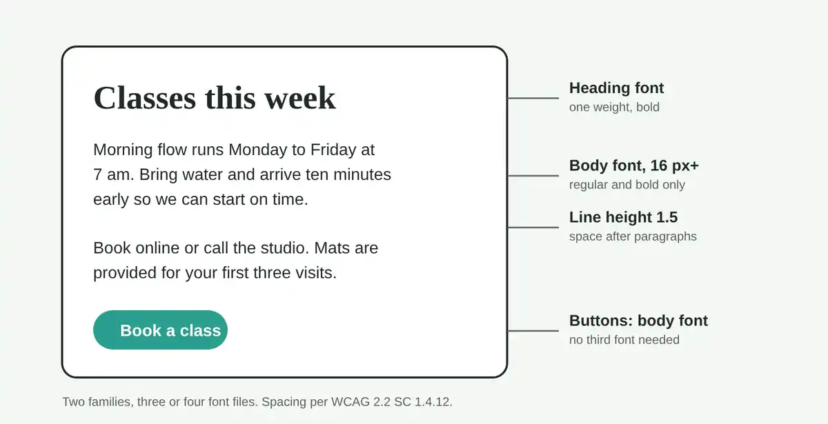
Here is what we would do. The logo becomes an image, as it should be, so the script font goes. Headings stay in the display font, but in one weight only. Body text keeps the text font in regular and bold. That’s two families and three files instead of seven.
Then we’d test on a mid-range Android phone outdoors. Display fonts often look lovely at heading size and fall apart at 14 pixels, which is where sites like this tend to use them for the class timetable. Moving the timetable to the body font at 16 pixels is the change we’d expect to matter most, because the timetable is the page people actually use.
Why it matters for your site
Fonts shape the first impression before anyone reads a word, so they deserve a few minutes of your attention. But they also carry a running cost in loading time, and they decide whether a 55-year-old customer can read your prices without zooming.
A few checks you can make yourself:
- Open your site on your phone outdoors and read a paragraph and your contact details. If you squint, the body size or the font is wrong.
- Count the fonts. Look at headings, body text, buttons, menu and footer. If you find more than two families, ask why.
- Check the slow moment. Load the site on mobile data and watch whether text appears straight away in a plain font or stays blank for a beat.
- Make sure you have the licence. The Web Almanac notes that most Google Fonts use the SIL Open Font License, which allows web use. A font bought for print may not cover your website.
The quick takeaway
- Use one family for everything, or two at most: one for headings, one for body text.
- Keep body text at 16 pixels or more, with comfortable line spacing, and test it on a real phone.
- Load only the weights you use, in WOFF2, with font-display set, so text shows while fonts download.
Your turn
Open your homepage on your phone and count the different fonts you can see. If the number is higher than two, which one would you miss least?
Sources and further reading
Image credits: Banner photo by Declan Sun on Unsplash. Images marked as AI-generated were created with AI (Claude) for iZenesis.